What is William Rose Wines?
Overview.
William Rose Wines is a winery located in the Whiteaker neighborhood of Eugene, Oregon. The winery works closely with small vineyards to source the best grapes Oregon has to offer, providing them with a wide array of exciting varietals. Our goal is to create approachable, food-friendly wines crafted with a blend of Old and New world styles which reflect our winemaker’s globetrotting past. The website serves as a place for a current or potential consumer to find any relevant information about the brand, from the brand story to tasting notes. The site also serves as the place for industry professionals to find trade information. The website reflects the brand's unique personality that differentiates it from the local competitors.
Problem.
The challenge is to emphasize the brand identity without distracting from the essential information that the user is looking for. I needed to make sure that any information that users look for when visiting a winery website was available on the William Rose Wines site. In addition, I needed to discover what appeared to be pros and cons of similar sites. To do this, I researched the competitors and surveyed potential users.
Goal.
William Rose Wines site will allow users to find essential wine and company information while displaying a unique interface that portrays the brand identity that makes the company stand out.
User and Competitor Research
Research Process.
In the beginning stages of my Brightboard research, I looked into potential competitors and questioned potential users. I noted the features the competitors did and did not have, as well as the feel and design of their interfaces. I then surveyed multiple users to get a feel of what applications they use for content storing, and what they like or are lacking from applications on the market. Together, this research provided me with a solid foundation to build upon. From the user research, three users exemplified the overall responses and thoughts shared by my survey respondents. These users also validated some of my own findings from the competitor research.
Competitive Analysis.
A good representation of the range of competitors include Dropbox, Evernote, and Pinterest. For notes, users report using Microsoft Word, a desktop tool, or a simple post-it. For images and links, they bookmark on their browser, or use Facebook or Pinterest. Box, Dropbox, and Google Drive are used almost strictly for professional reasons for files like PDFs. Interestingly, four of the six specifically mentioned applications have a blue and white color palette. In terms of application functionality, there did not appear to be an application that fell in-between the professional applications like Box and Google Drive and the applications for fun, personal use like Facebook and Pinterest. It became clear that none of the users used an all-encompassing application to store notes, images, and links in one place. This is the void that Brightboard is trying to fill.


Melissa
Office Manager
Age: 26 // Location: Eugene, OR
Key User Points
- 1. Saves content for personal interests
- 2. Bookmarks on browser or jots notes
- 3. Loses or forgets about content
- 4. Needs a clean, organized space to not get overwhelmed
“A lack of good organization will quickly frustrate me and cause me to abandon a task”

Jaclyn
Consultant
Age: 26 // Location: New Orleans, LA
Key User Points
- 1. Works remotely
- 2. Needs to reliably share content for work
- 3. Needs a lot of storage space and folders
- 4. Wants a notification when shared content is viewed
“I work remotely, so sharing my work and relevant files is absolutely crucial. Knowing that my content gets shared reliably and securely is very important to me.”

Lisa
Designer
Age: 28 // Location: Canada
Key User Points
- 1. Constantly jots down inspiring ideas for work
- 2. Needs an accesible tool that works quickly
- 3. Likes something that mimics traditional, free-form note-taking
- 4. Would like it to feel like an organized, high-tech journal
“I love the convenience that technology allows in terms of portability and content organization. I also love the authentic feel of free-form journaling. The combination of the two would be wonderful!”
Branding
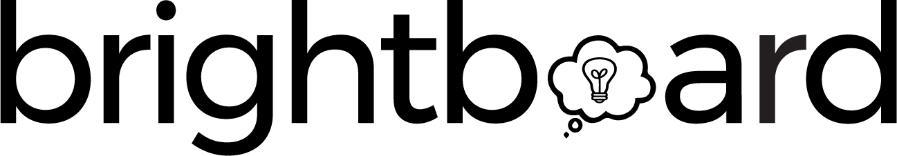
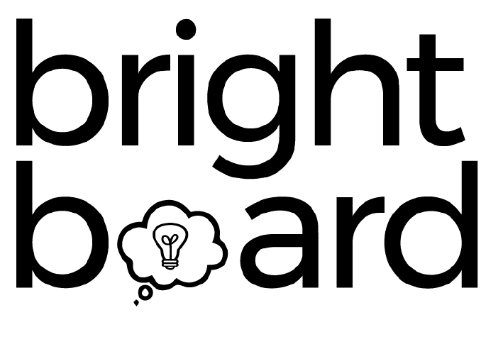
Logo.
The Brighboard logo concept went through iterations based of the thought of the “bright ideas” that the user is storing in the application. The concept of a light bulb representing the ideas came up early and stuck through most of the logo iterations. I found it easy to incorporate into the Brightboard name and the roundness of the bulb fit with the round curvature of the chosen font.
Color Palette.
In researching color palettes, I chose one that could be described as fun and professional to match the intended personality of Brightboard. Brightboard needed some accent colors that go along with the “bright” concept but that were not too intense or distracting.
Typography.
For the fonts, I chose one serif and one sans serif. For my sans serif font, I was searching for a geometric and clean font. Montserrat offers rounded letters, with the “o” being a perfect circle. The font feels modern and not overly formal. I used the "normal" weight in the font to get a feel that was not too light or too overbearing for these larger headlines. My serif font Roboto Slab matches the geometric feel of Montserrat. It puts a modern twist on serif by using slab serifs to grab the user’s attention to the bits of descriptive text used in Brightboard.


Montserrat - Headlines
ABCDEFGHIJKLMNOPQRSTUVWXYZ
abcdefghijklmnopqrstuvwxyz
Roboto Slab - Small Text
ABCDEFGHIJKLMNOPQRSTUVWXYZ
abcdefghijklmnopqrstuvwxyz
Brightboard Site Map and Wireframes
I created a site map and wireframes in Sketch and uploaded them to invision to have an initial user flow and site navigation to base my further designs on. The sitemap and wireframes focus on user onboarding and the primary features of Brightboard.
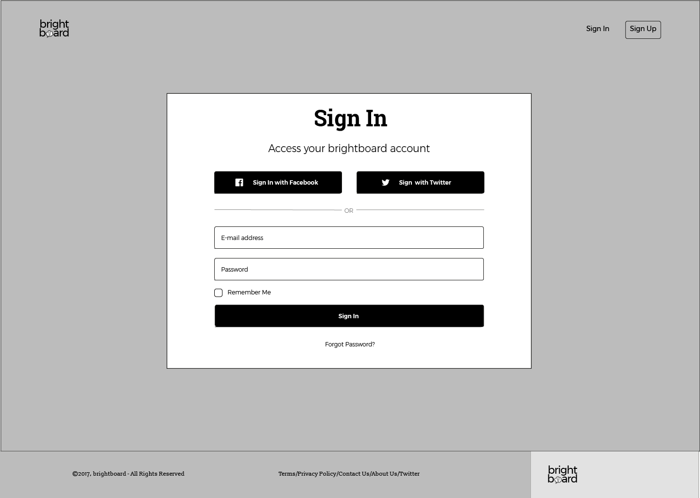
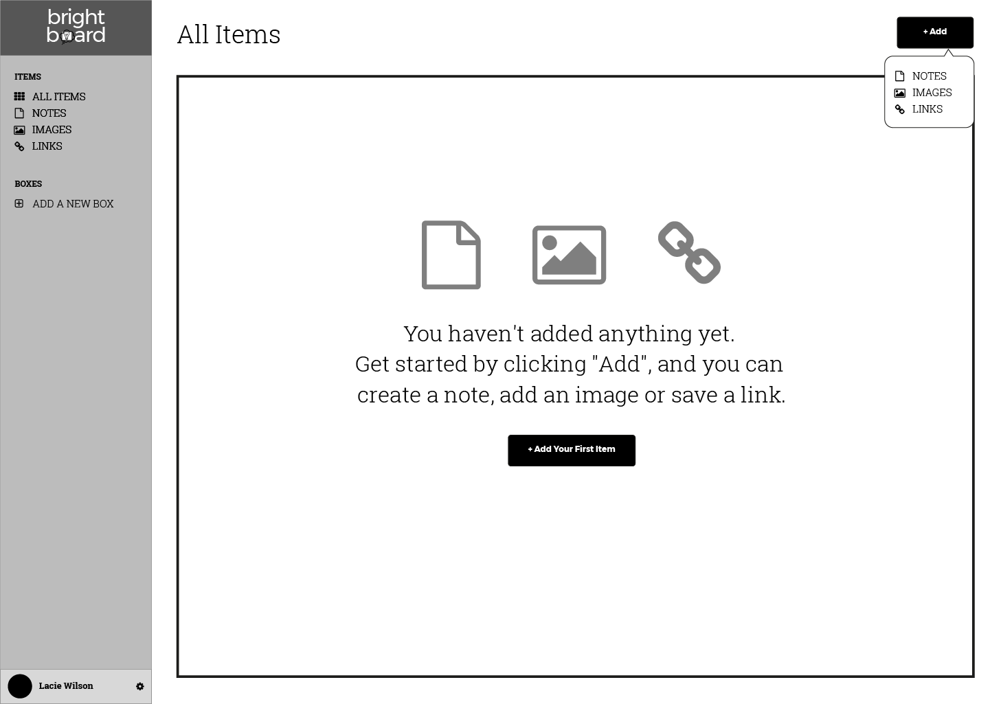
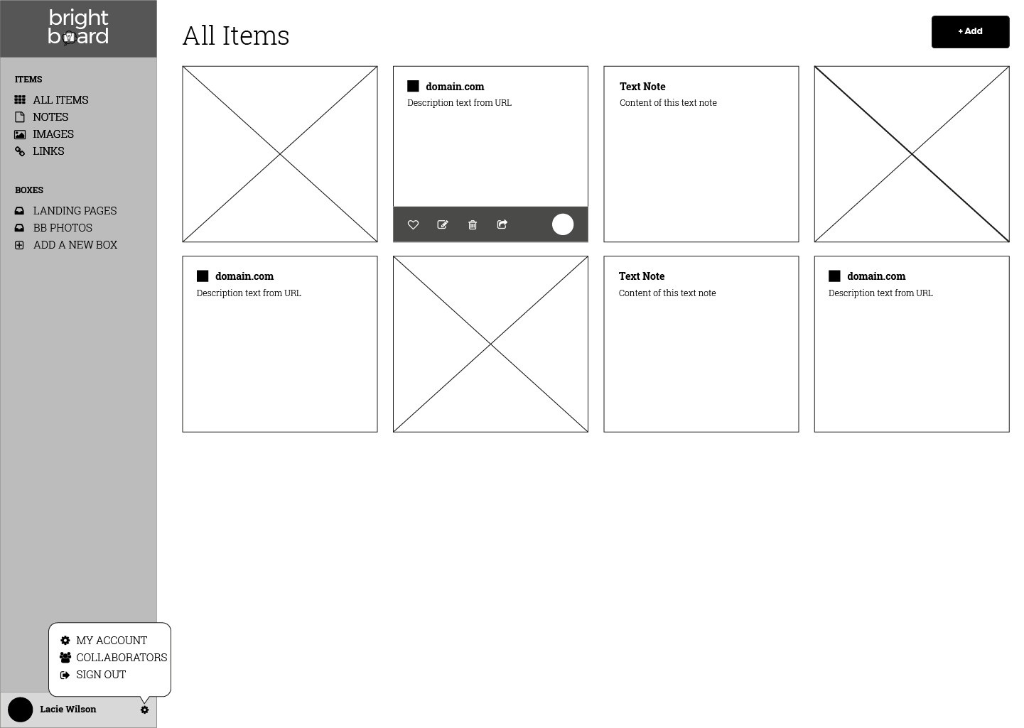
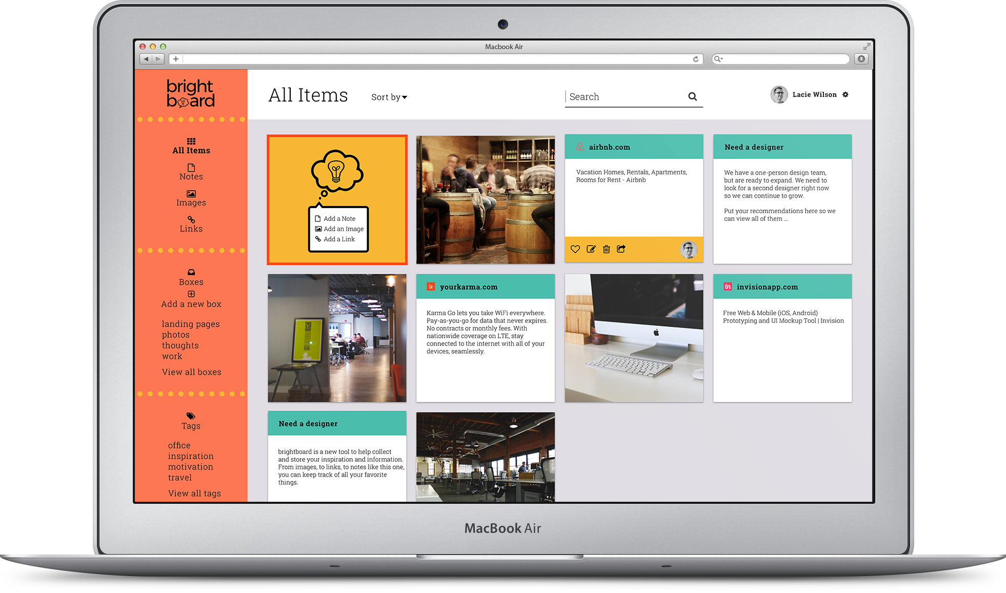
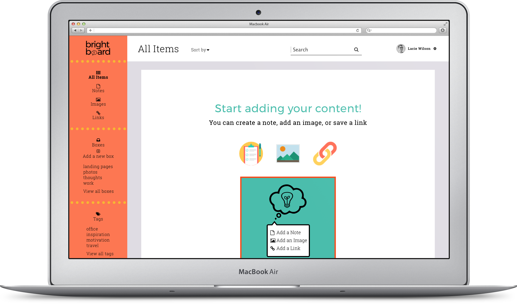
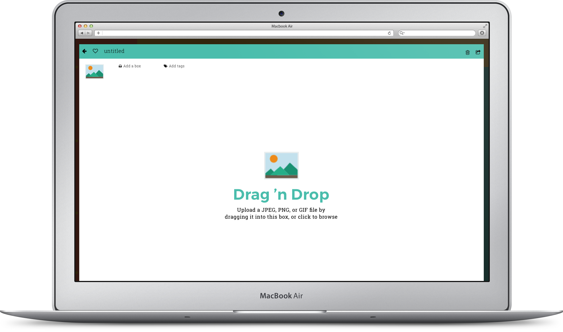
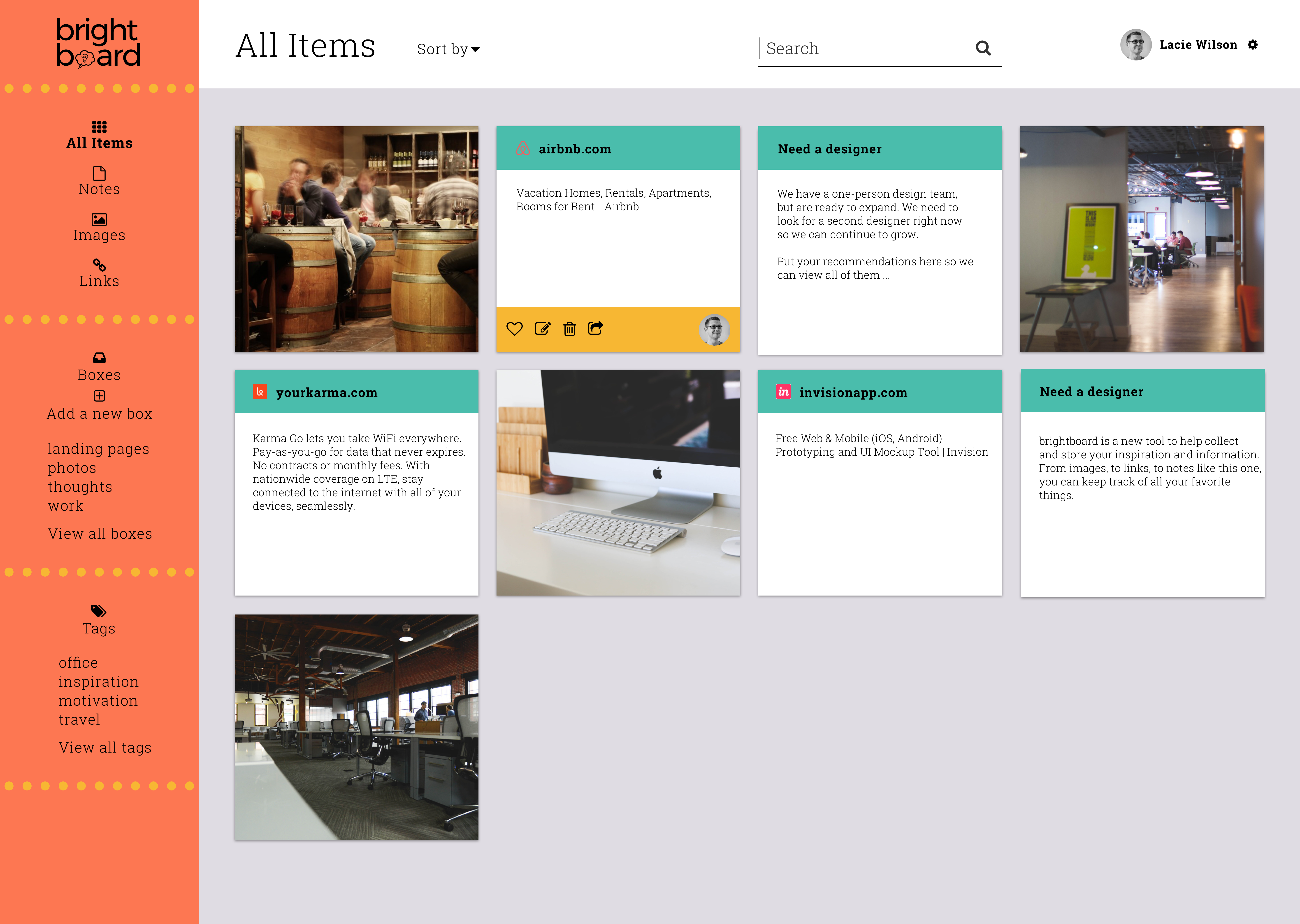
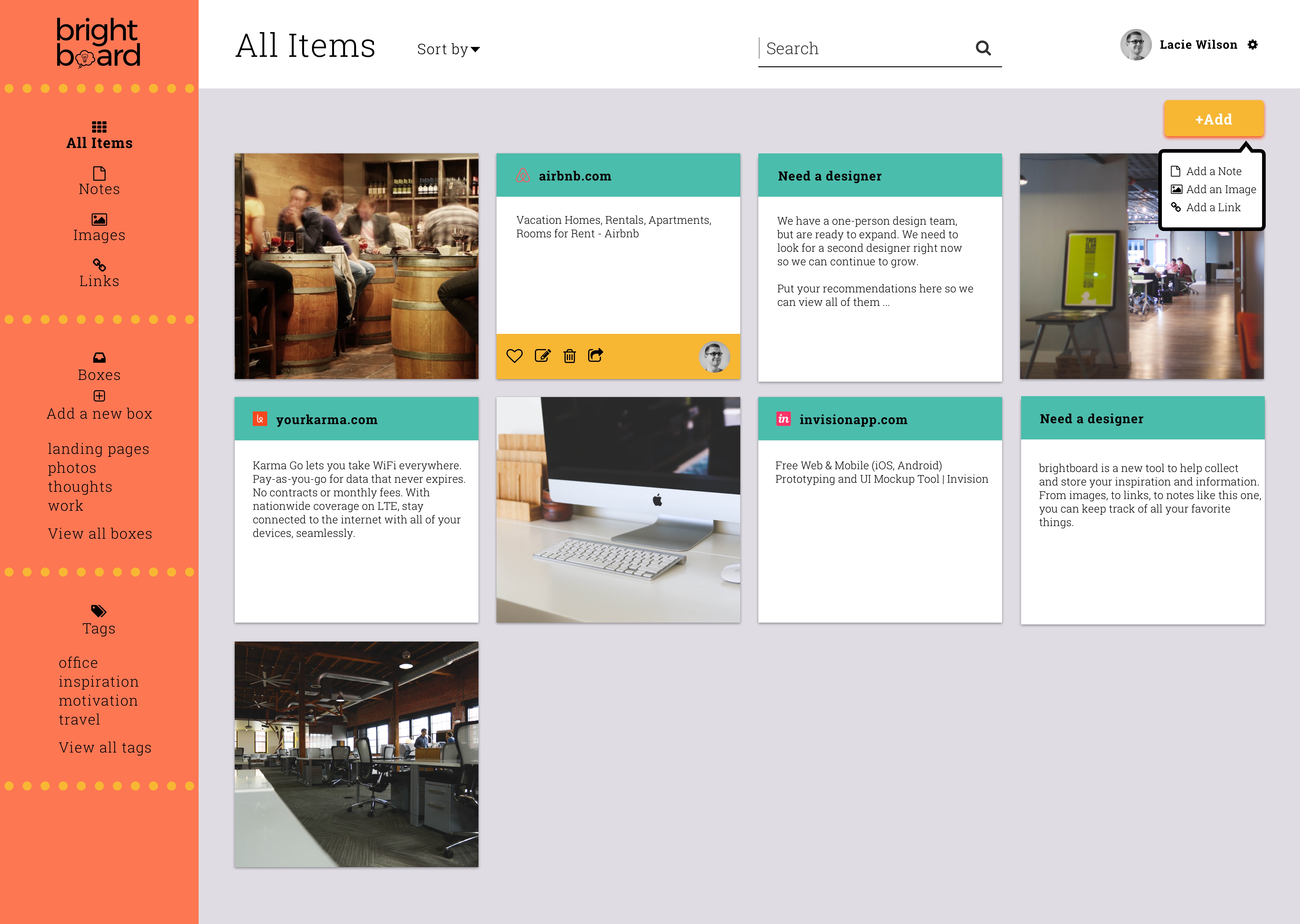
Brightboard Mockups and Preference Testing
From the wireframes, I added my color palette, logo, typography, and other visuals in both Sketch and Adobe Illustrator to bring the wireframes to life. I took these mockups to Invision to create a navigatable mock website.
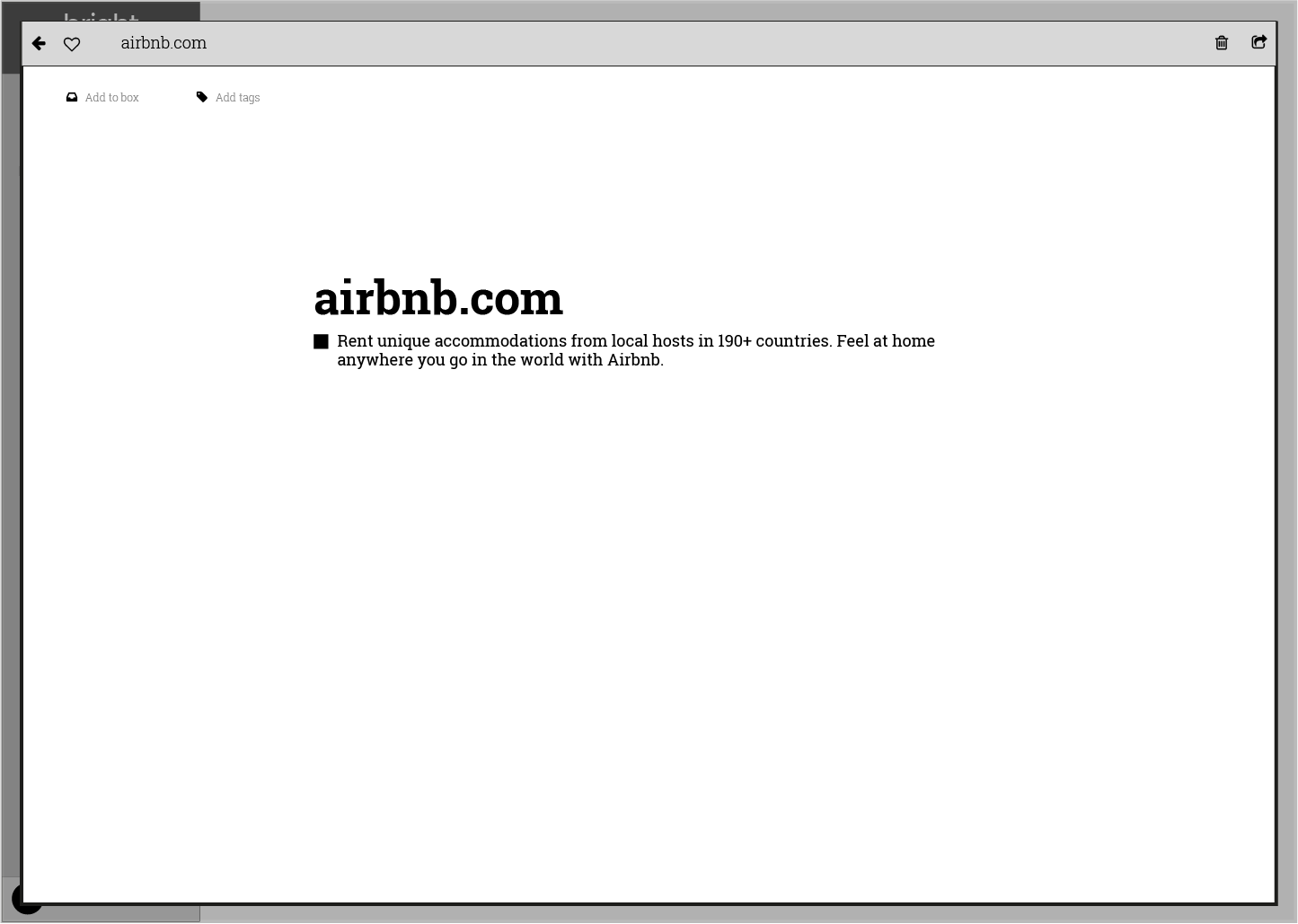
VIEW BRIGHTBOARD MOCKUPS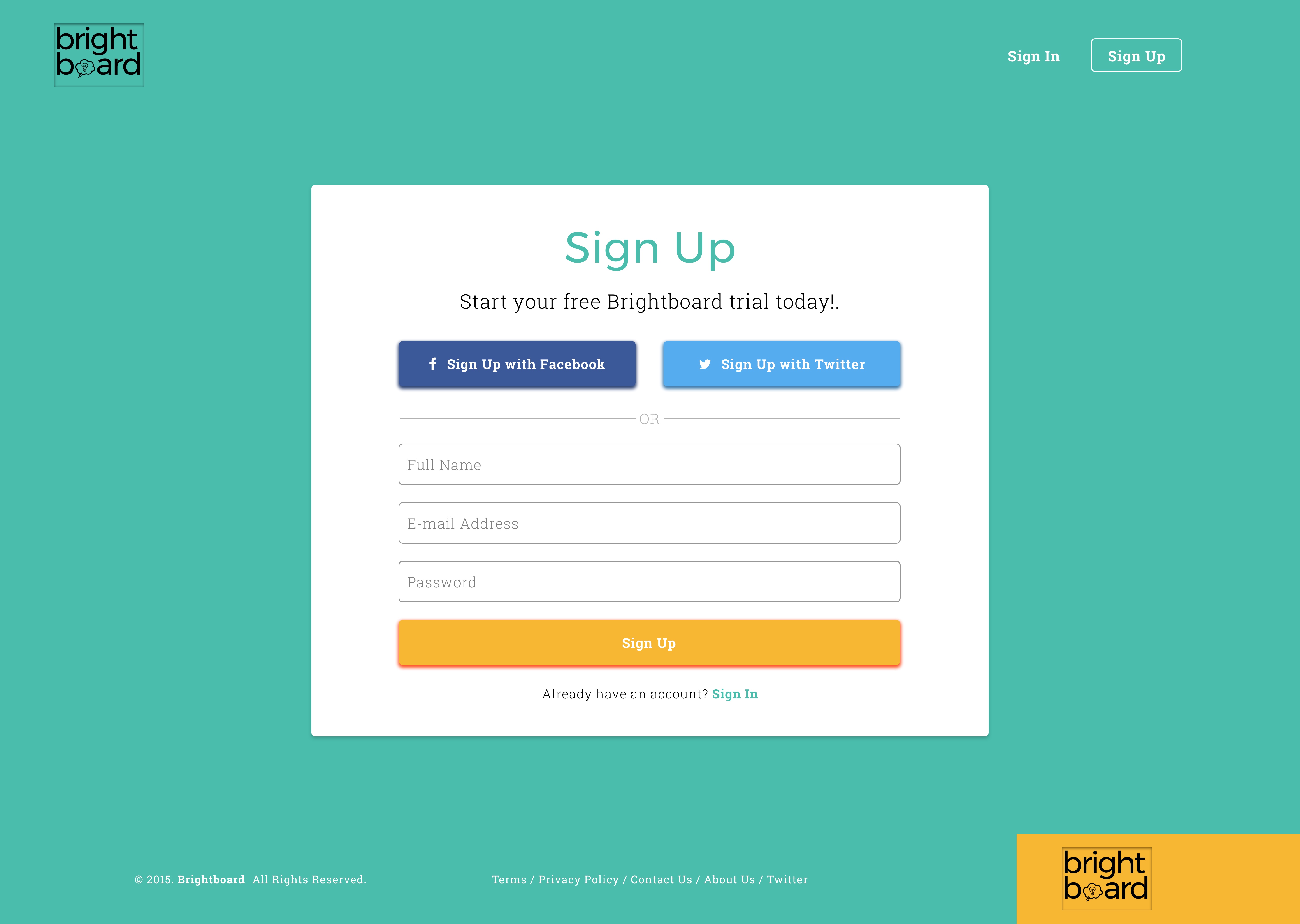
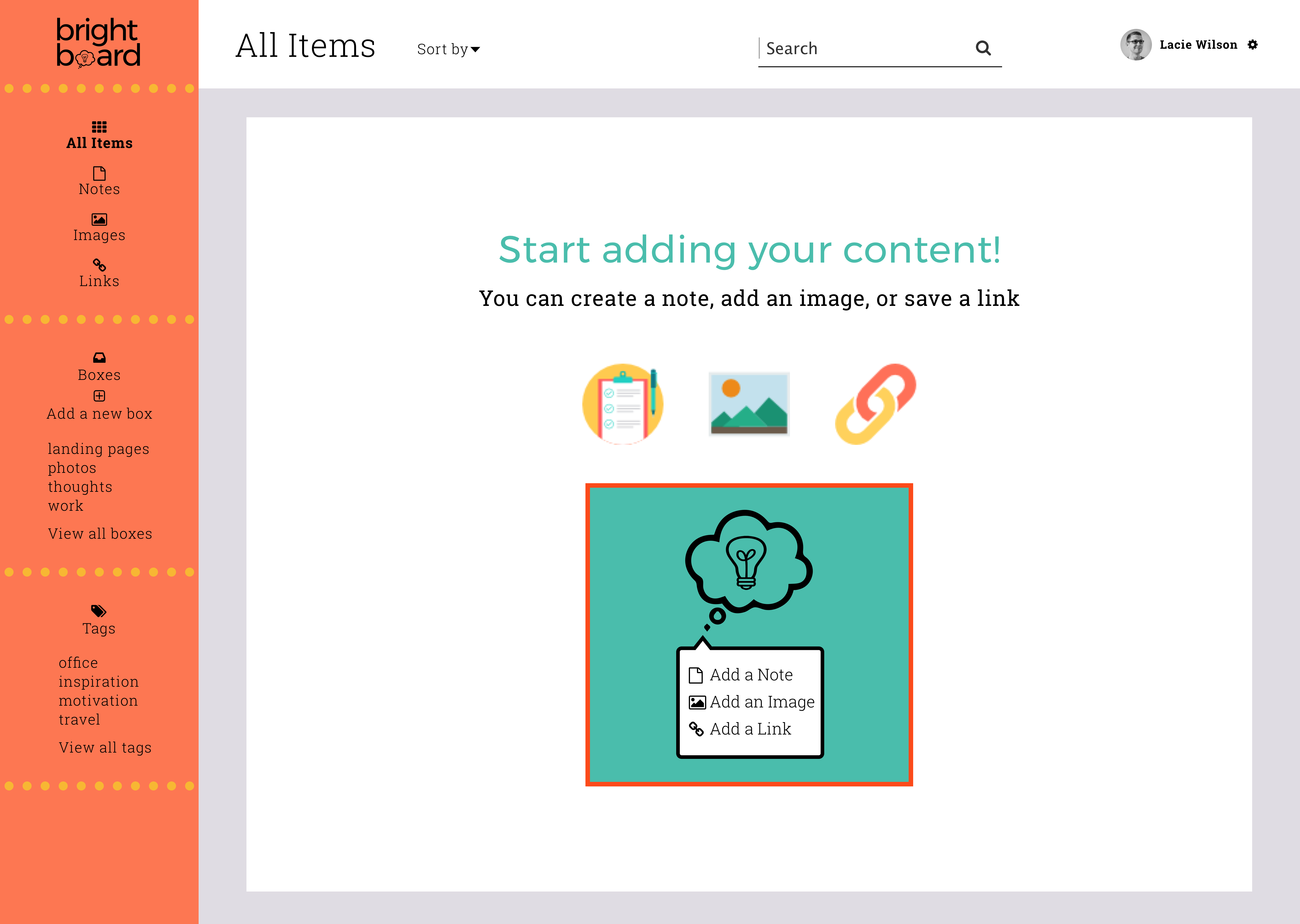
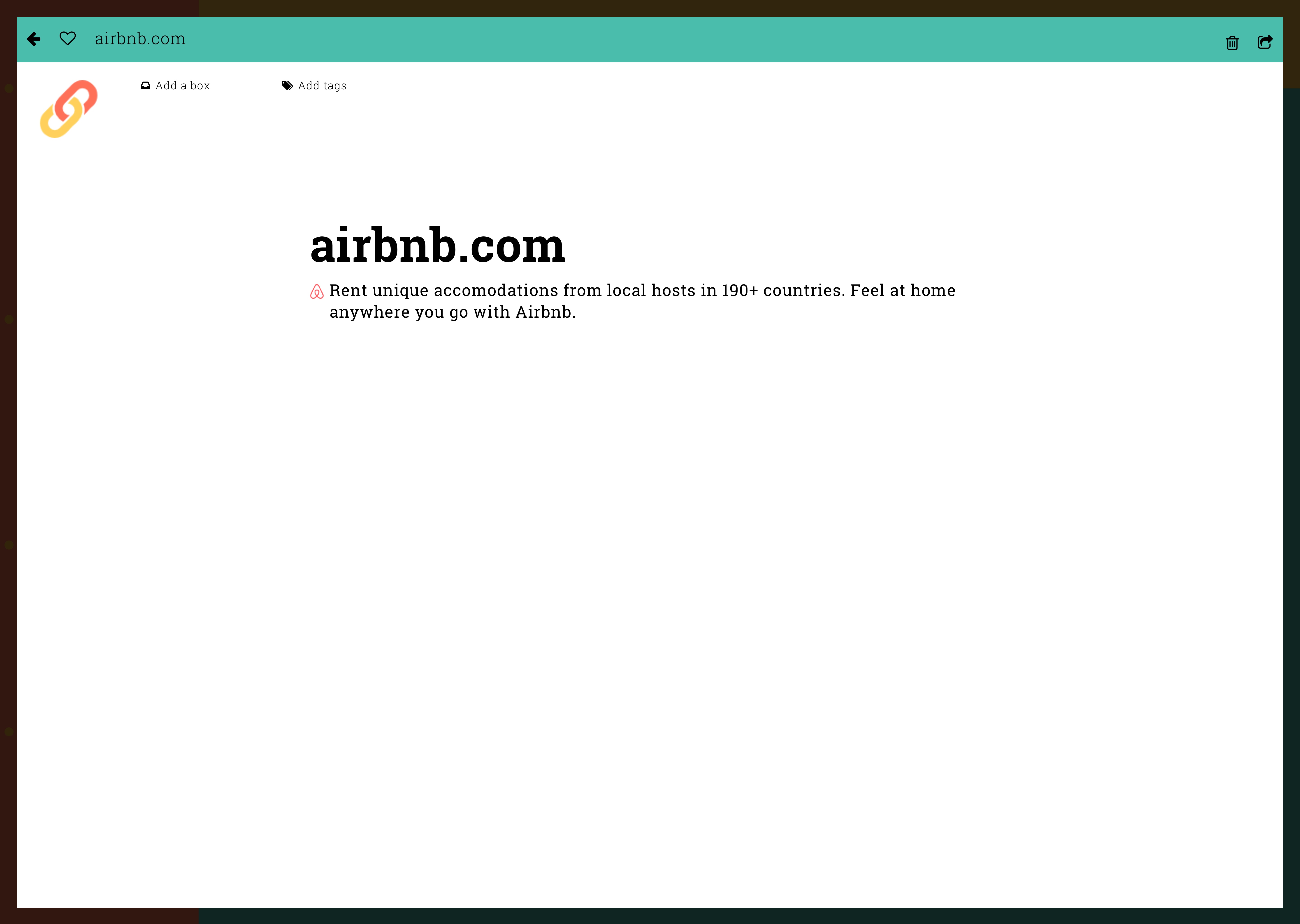
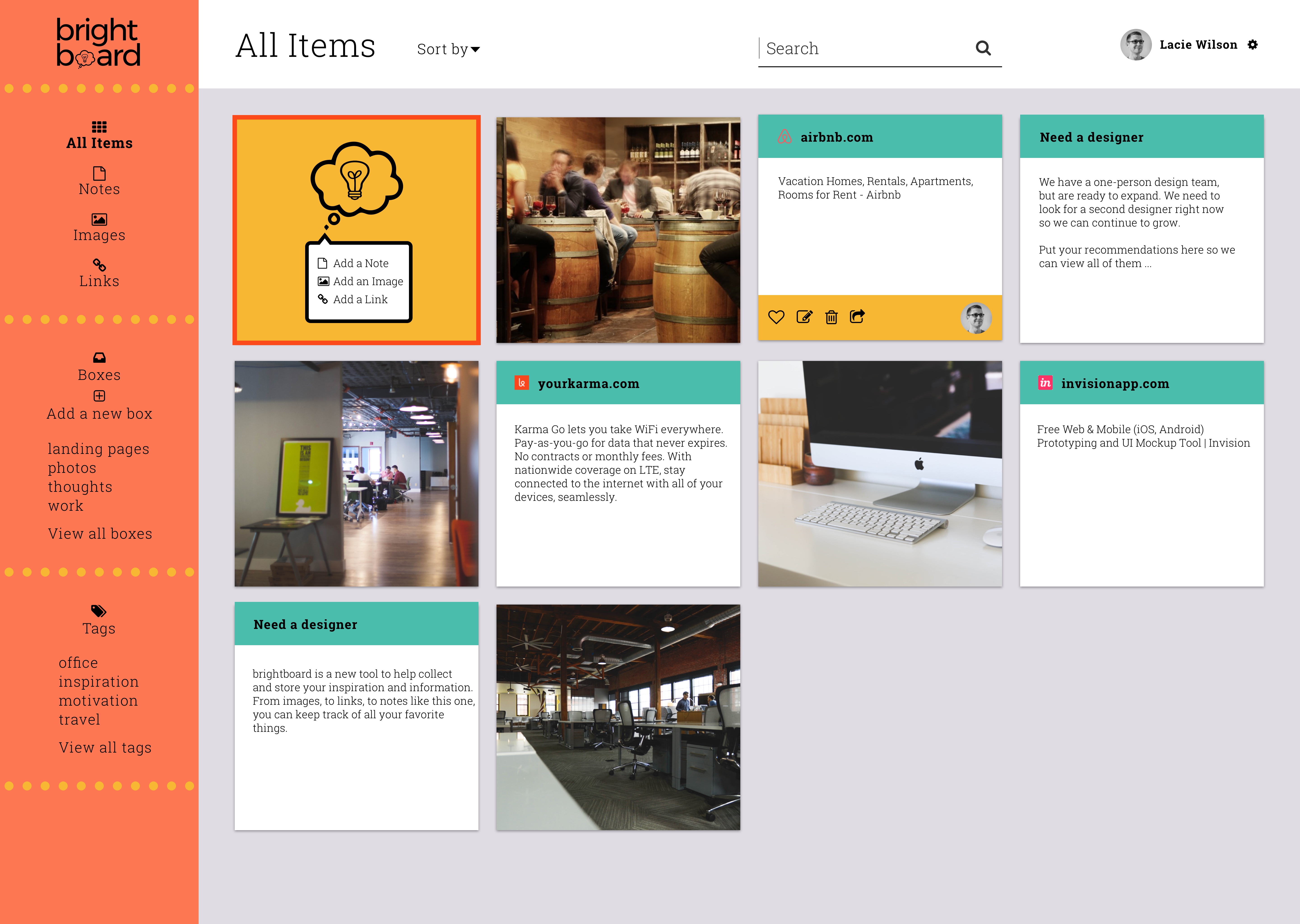
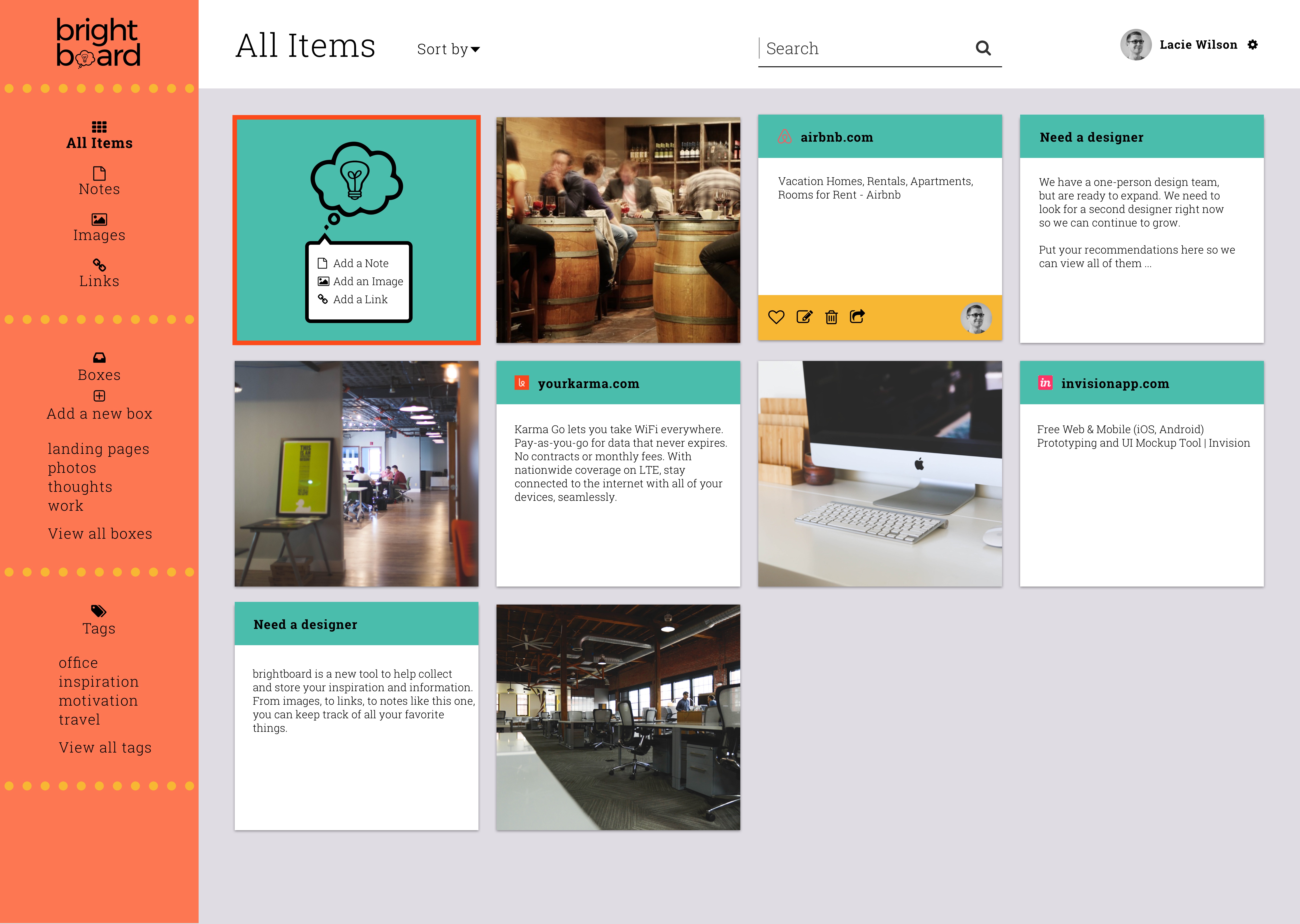
I did a preference test to survey users about what screen made more sense to them to "add" links, notes, and images. The users were able to view three screens that were similar aside from the look and placement of the "add" feature. Interestingly, the results were almost exactly split between the three screens. One screen had slightly more votes at 36%, and was also my preferred screen, so I chose this version.
Conclusion
The goal of the Brightboard project was to create a unique application, both in terms of functionality
and appearance. A main component to differentiating Brightboard from content sharing competitors was to
replace the sterile interface with one that had a more colorful, inviting appearance.
I selected a color palette that had more than one color, and made these colors vibrant yet unobtrusive.
I steered clear of the blue and white palette used by many content sharing applications.
The palette selected was professional, fun, and matched the concept of theBrightboard brand name.
My branding for Brightboard took clean, geometric lines and paired those with a lightbulb
and thought bubble shape to create a relevant logo that can be recognized when separated from the
brand name. The interface layout focused on making the content very clear and organizable for any level user.
My layout design is intuitive for the user and makes key features, like adding content, easily visible.
The result of this work is an application that stands apart from the competitors in both functionality
and design. Brightboard fills a gap in the market and offers a user experience that is not seen in other
major applications available today.